The problem
Almost every healthcare app assumes there’s one account for one patient, and that the patient is the person tapping the buttons. A lot of care doesn’t work that way. A parent keeps track of a child’s medication, an adult child books a specialist for an ageing parent, or a husband or wife manages a recovery.
I call these people the invisible second user, because the software doesn’t know they exist. So they end up sharing logins they’re not supposed to share, translating medical language for the person they look after, and juggling several portals on one phone. And when something slips, the system blames the patient.
I’m a caregiver myself, so I’ve watched this happen up close. The whole project comes down to one question, which is how these tools should be built when the person using them is looking after the patient and isn’t the patient themselves.
What I did
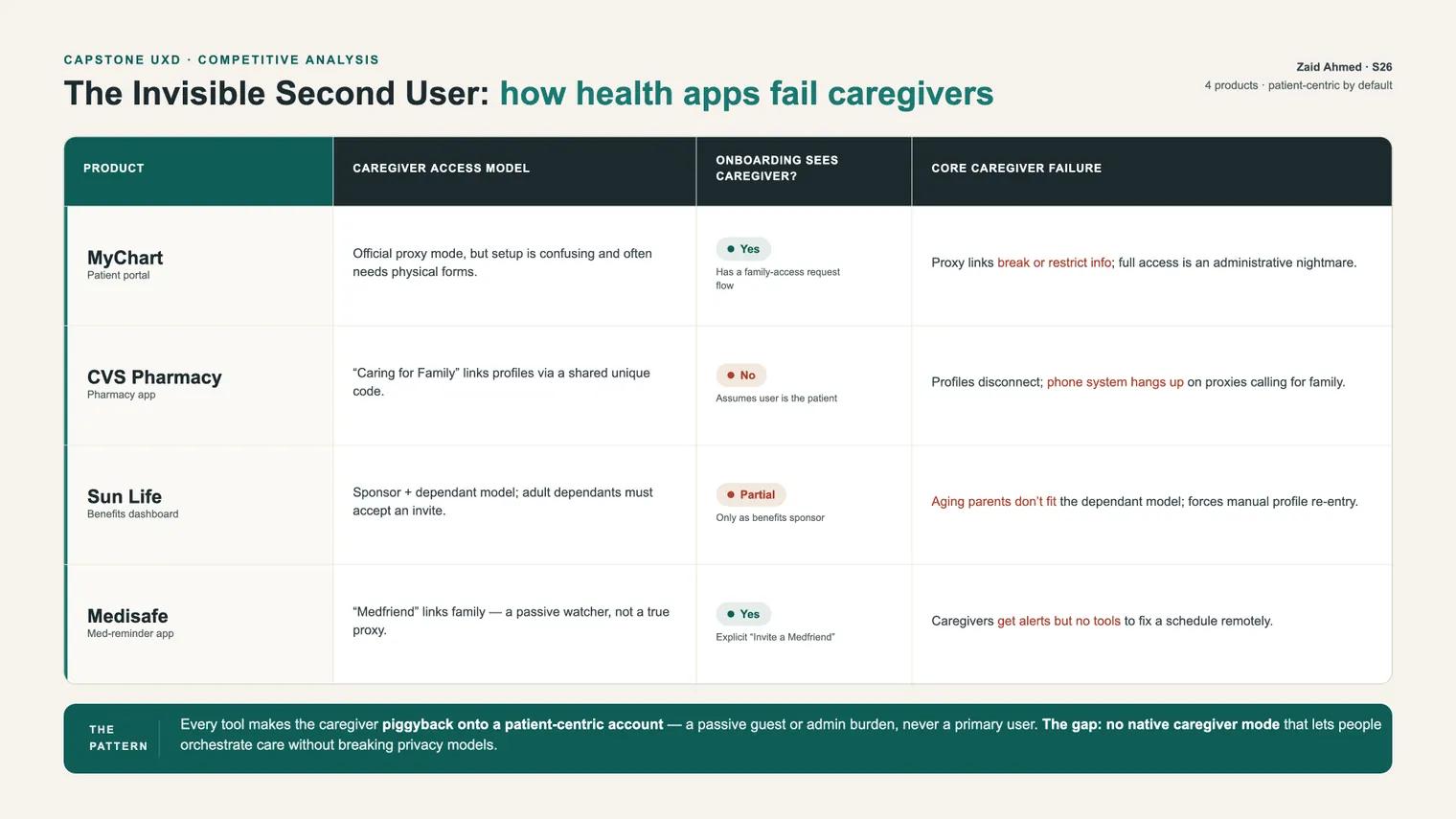
I started with four tools that caregivers actually use, and went through each one looking for where it lets the second user down.
- MyChart has official proxy access, but setup is confusing, often needs paper forms, and the proxy link limits what a parent of a teenager can see to bills and bookings.
- The CVS pharmacy app has a "Caring for Family" link, but onboarding assumes you’re the patient, and its phone system has hung up on caregivers calling for a relative.
- Sun Life runs on a sponsor and dependant model. Ageing parents don’t fit it, and you have to re-enter dependants by hand even when they share your plan.
- Medisafe’s "Medfriend" only pings the caregiver after a dose is already missed. It doesn’t let them fix the schedule.
All four had the same thing underneath. The caregiver piggybacks on the patient’s account, either as a guest or as an admin chore, and never gets to be a user with their own identity, tasks and consent.
Then I interviewed three people who see the problem from different sides. One is a family caregiver who manages two children across three portals, one is a physician who sees the gap from inside the system, and one is a designer who built a patient-facing booking tool. I asked about what they’d actually done, because opinions about a future app don’t tell you much. So instead of "would an app like this help", I asked "walk me through the last time you booked an appointment for someone you care for."
Four things came out of those conversations.
- Logins get shared. The caregiver keeps every account under one login and hands the master password to his wife so she can check a dosage from her phone.
- Tasks drop in the gaps. They missed a speech therapy appointment because each parent assumed the other had booked it, paid a cancellation fee, and waited two months for another slot.
- Clinical language creates panic. The physician described caregivers seeing a raw, slightly abnormal result with no context and spiralling, when all they needed was "the doctor reviewed this, no action needed."
- Systems talk to the wrong person. Appointment reminders are addressed to children who don’t own phones, so the texts land on a parent the system refuses to acknowledge.
The physician even put a number on it. By their estimate, at least a third of their consultations involve a relative steering the care.
That estimate is one physician’s recollection from one interview, so please don’t read it as a measurement.
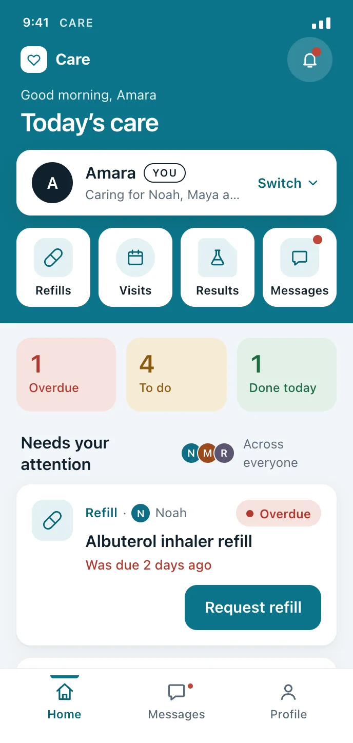
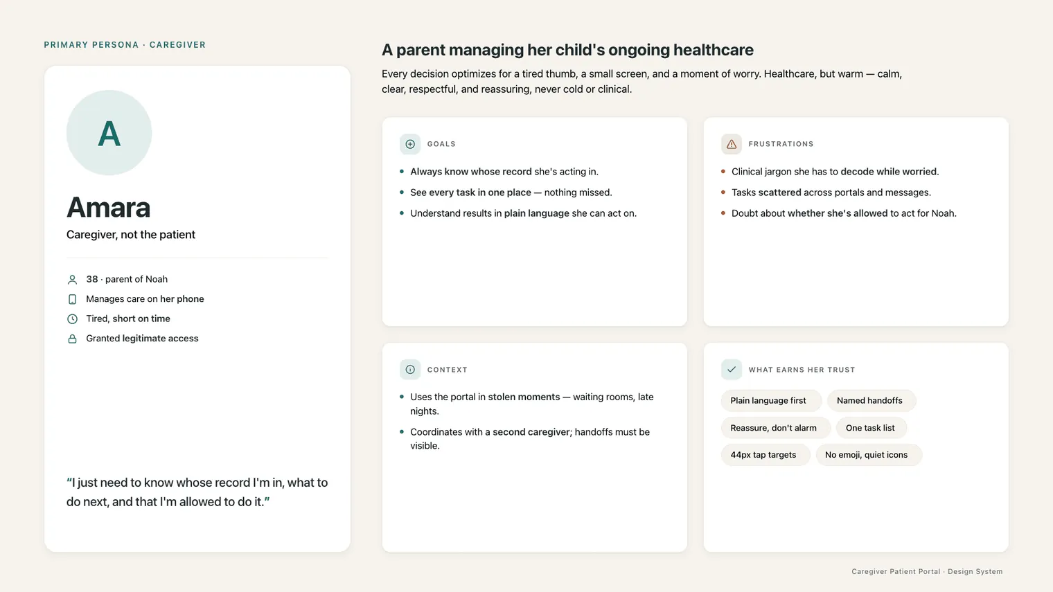
From the research I built a persona to design for. Amara is 38 and manages care for three people, Noah, Maya and Robert, from her phone in the gaps of a normal day. She’s a persona based on a real caregiver from the research, and none of the screens she uses today were built with her in mind.
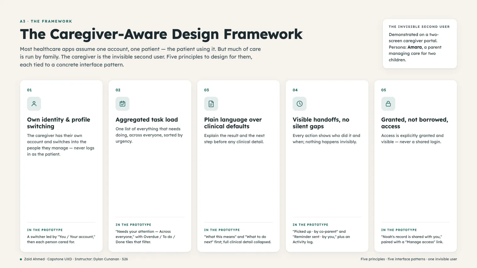
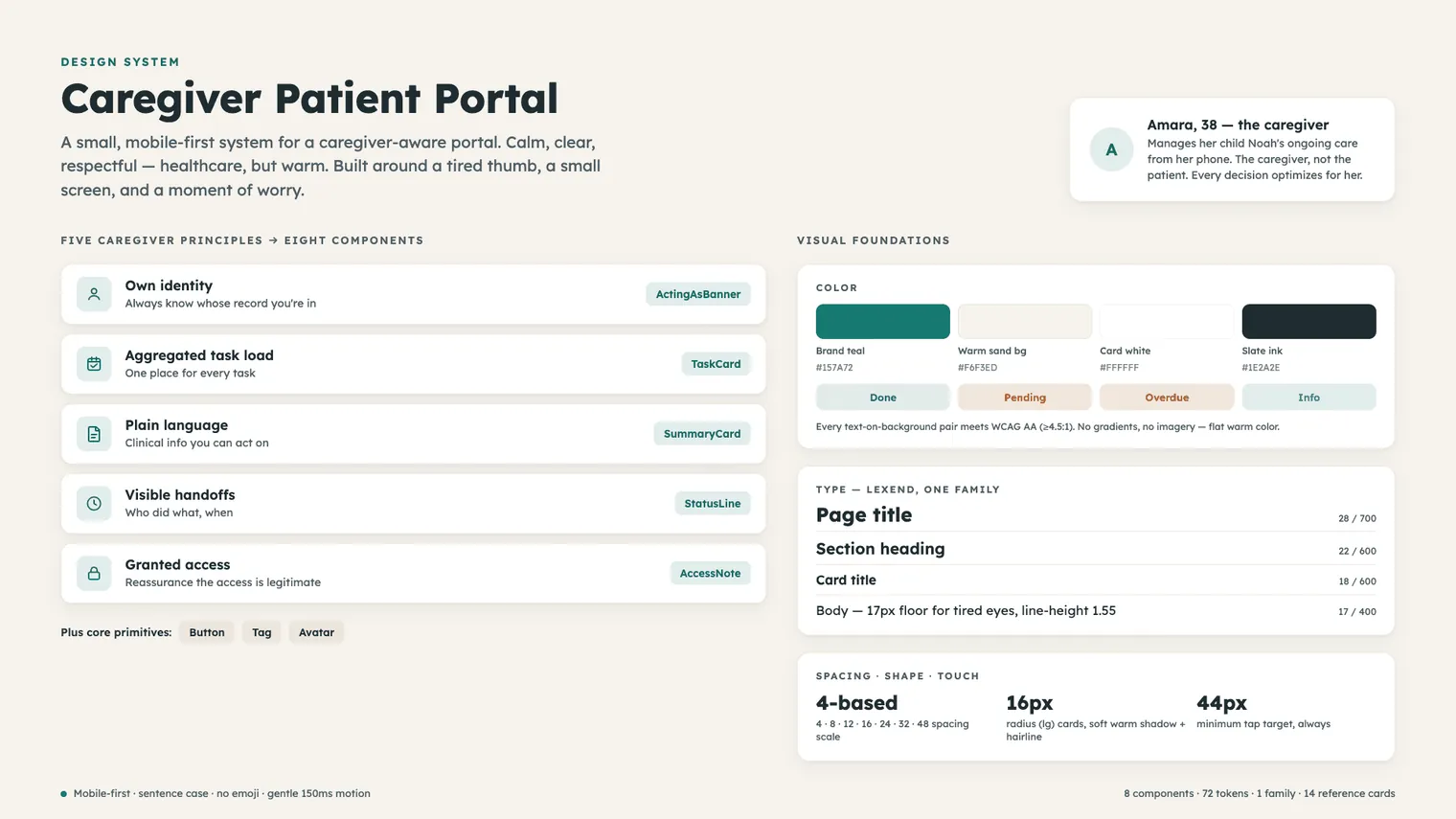
All of that led to five principles, and I tied each one to an interface pattern so it’s something you can actually build.
- Own identity and profile switching. The caregiver has their own account and switches into each person they manage. They are never asked to become the patient.
- Aggregated task load. One list of everything due, across everyone, sorted by urgency, with Overdue, To do and Done tiles that filter it.
- Plain language over clinical defaults. Lead with what a result means and what to do next. Keep the clinical detail one tap away.
- Visible handoffs, no silent gaps. Every action shows who did it and when. "Picked up, by Jordan, today 8:05 AM", plus an activity log per item.
- Granted, not borrowed, access. Access is given on purpose and stays visible. The record tells the caregiver why they can see it and lets them manage who else can.
Granted access is like adding someone to your YouTube family or your Google Home family. They are given permission. Borrowed is when you share your account credentials and they log in to your main account to see things.
The same five principles in a bank and a tax service
In Round 2, one of the caregivers told me, without being asked, that managing someone else’s banking, insurance and taxes feels exactly like this. She was right, and I didn’t want that to end up as one line in a report. So v3 has a switch under the phone with Health, Money and Taxes on it. When you flip it, the same app becomes a household’s banking or a family’s tax season.
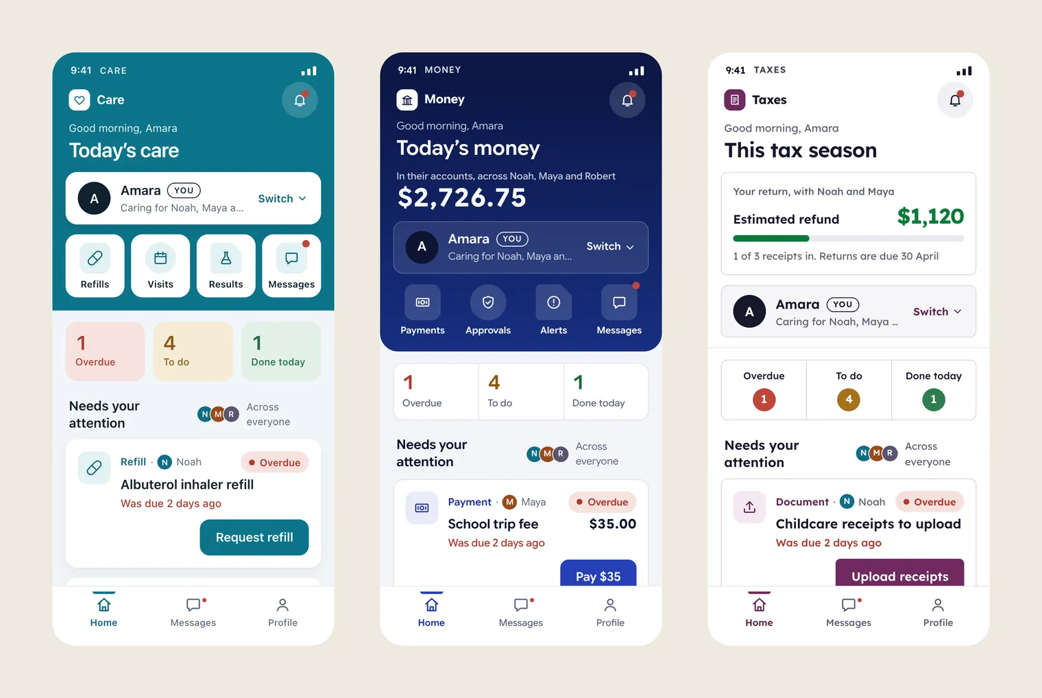
When you switch, the words change, and so do the task types, what a record contains, and the reason you have access. A refill turns into a payment. A throat swab result turns into a declined electricity payment, still explained in plain words with what to do next. And "Noah’s record is shared with you by his clinic" turns into "Robert gave you power of attorney access on 3 March", or "Robert named you his authorised representative on 3 March."
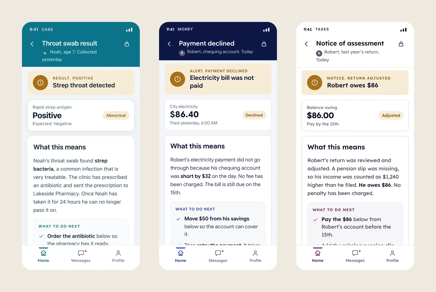
Everything else stays the same. You still get the switcher with You at the top, one list across everyone, the plain meaning before the detail, a record of who did what and when, and access you can see and manage. Those five things are the framework, and each domain is really just a pack of vocabulary and data sitting on top of it.
I researched and tested the health version with caregivers. The money and tax versions are demos I built from the same principles, and no caregiver has tested them yet.
Key decisions
Straight to a working prototype, no wireframes
What I choseI went straight to a build, in Claude Design.
Partly it was the course deadline, and partly I wanted to find out how far AI could carry a build if I directed it closely. Round 2 showed me the upside, because people only really understood the idea once it behaved like an app.
It saved me weeks, but the first expert review found problems a paper wireframe would’ve caught. The build also only covered the happy path, so it had no empty, loading or error states.
What "switching" means
What I choseEveryone is the default view, and it keeps the single list that held up in testing. When you tap a person, the whole app switches to their tasks, records and access, and the header shows their name and colour. Tapping "You" opens a profile you can edit.
In v1 and v2 the switcher named a person but the list still showed everyone, and the caregiver’s own profile was just a fixed label. The expert review flagged it, and then all three caregivers in Round 2 expected the whole view to change.
There are now two modes to keep straight. The Home tab says whose home it is, because the dry run further down showed people new to the app losing track.
A switch outside the phone, not inside it
What I choseI put it under the phone, on the page. Each domain gets its own colour (teal, indigo and plum), while the status colours, the people’s colours and every layout stay fixed.
No real product would ever have this switch. Keeping it outside the phone makes it clear that it’s me changing the demo, and that it isn’t a feature of the app.
Each version keeps its own data, so a task you finish in Health is still open in Money. The note next to the switch says so.
Never colour alone
What I choseA refill, an appointment and a reminder each get a label word, an icon and a shape of their own.
One participant in Round 2 mixed up three task cards that mainly differed by tint.
The cards are a bit busier now.
Ask before money moves, not before a refill
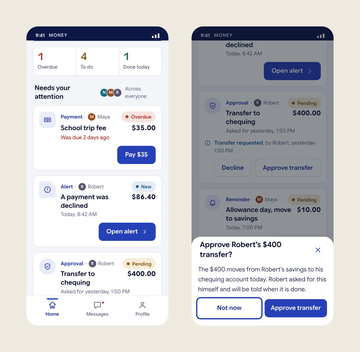
What I choseA refill still goes out on one tap, and you can cancel it. Paying, approving a transfer, moving money and filing a return all ask first, and the sheet says whose money it is and who’ll be told. An approval can also be declined.
The health version had nothing you couldn’t undo, so it never needed a confirm step. The money version did, and I’d carried the one-tap pattern across without thinking about it. The dry run caught that.
It’s one more tap, but only on the actions that deserve it. If something fails and you retry, it doesn’t ask you a second time.
An adult runs his own list
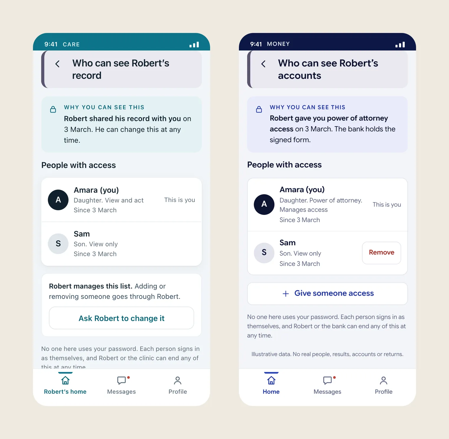
What I choseRobert shared his health record and his tax file himself, so he runs those lists, and Amara can only ask him to change them. At the bank she holds power of attorney, the screen says so, and she manages the list. For her children she manages it as their parent.
In the first v3 build, Amara could remove her own brother from their father’s record, and nothing on the screen said she had the right to do that.
The access screen doesn’t look identical everywhere any more. It changes with the reason for access, and that’s really what principle 5 is about.
The work
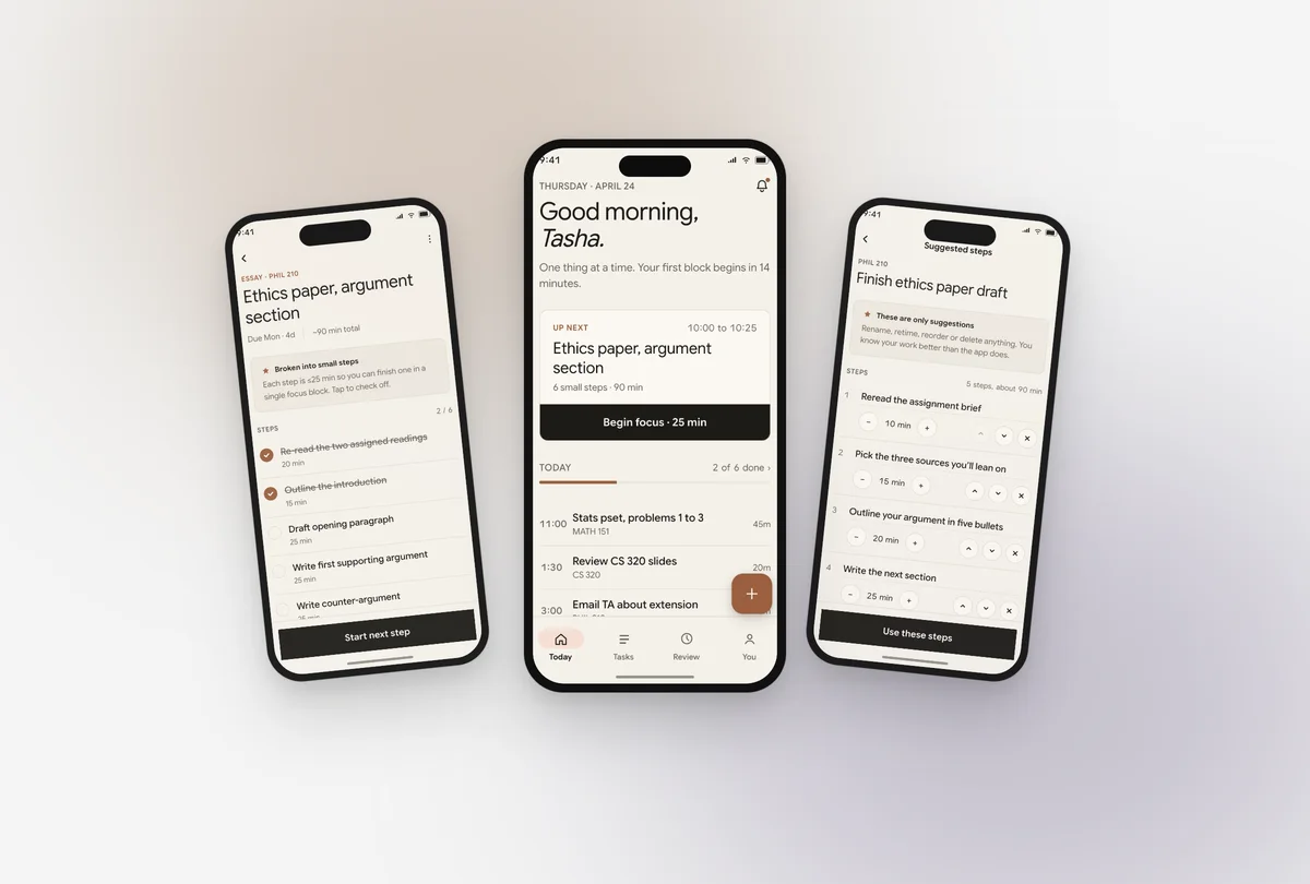
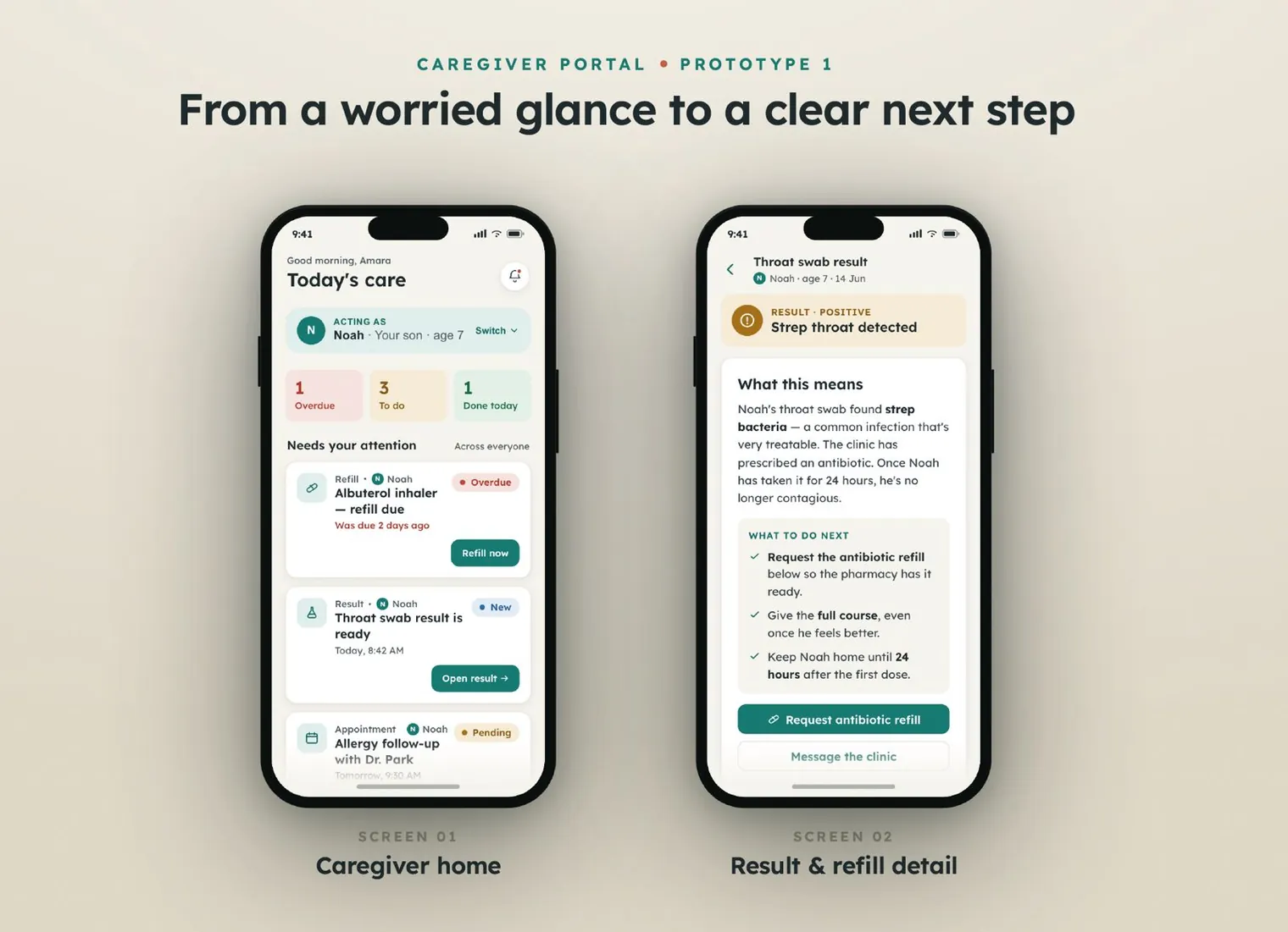
v1 and the expert review (Round 1). The first build had two screens, a caregiver home and a detail screen for a result and a refill. Before any user touched it, I reviewed it against Nielsen’s heuristics and my own five principles. That gave me ten observations, of which three were major, four were minor, one was cosmetic, and two were patterns worth protecting. The ones that stung were these. The caregiver’s own profile was missing from the switcher, and the "acting as" banner said one thing while the list said another. The same reminder was credited to "you" on one screen and to "automatically" on the other. The status tiles looked tappable but did nothing, and a muted text colour failed WCAG AA at small sizes.
v2 and the fixes. I added "You / Your account" to the top of the switcher, separate from the people being cared for, and made the tiles filter the list. Every handoff now shows one person and one time, everywhere it appears. I also added a "Manage access" link on the access note and a bottom navigation bar, and darkened the muted token from a failing grey to #44525B, which is about 7 to 1 on the warm background. I only half fixed the "acting as" confusion, and that was on purpose. Only a real person could tell me whether people read the model correctly, so I left it for Round 2 to test directly.
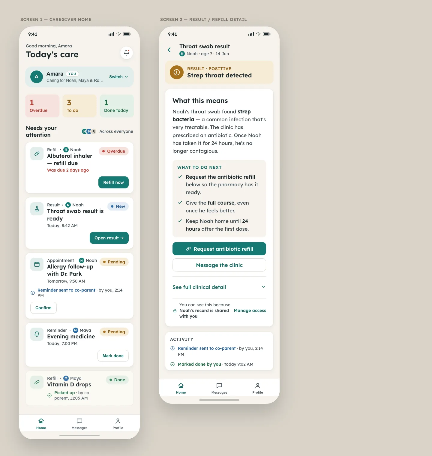
Round 2 with three caregivers. These were moderated think-aloud sessions over Google Meet, about twenty minutes each, with one task per principle. All three participants currently manage healthcare for someone else. I recruited them through community contacts and picked people whose situations were different from mine, to limit my own bias. All three completed the core tasks, and they rated the ease between 6 and 7 out of 7.
The switch button was straightforward, but I assumed I’d be able to actually switch the account.
A few things broke. All three expected switching to be real, and expected to be able to edit their own profile. One of them couldn’t find "Manage access", and one confused three task cards that looked alike. The rest held up well. Everyone found and used the switcher without trouble, nobody had a problem with the plain-language result, and the handoff record was easy to find.
3 of 3 participants expected the profile switch to change the view, and 1 of 3 couldn’t find "Manage access". With three participants, this points in a direction but doesn’t prove anything.
v3, built in code. v3 is a React app that I built with Claude Code, working from a spec I wrote out of the Round 2 change list. It has one data model with three packs of words and sample data on top. Each pack has fourteen screens and states, which are home across everyone, the switcher, one person’s view, an editable profile, a task, a record in plain words, manage access with its confirmations, messages, nothing due, no one added, an action that fails and recovers, a lost connection, loading, and v2 next to v3. Every button works. All the data is made up, which it says on every screen, and it starts fresh for every visitor.
A dry run with five AI personas
This isn’t research with people, and I haven’t counted any of it in the rounds above. No caregiver has tested v3 yet.
Before asking real people for their time, I wanted to catch my own mistakes first, so I did a dry run. I set up five AI agents and had each one play a caregiver persona I’d written. There was a hurried parent who skims, a retired man who’s afraid of taps he can’t undo, a daughter who shares her father’s care with her brother and trusts nothing, a blind screen reader user, and a shift worker reading in his second language. Each one used the live prototype through a text-only window that showed what a screen reader would announce, and they couldn’t see the code or this page. I logged every tap, so I could check what they said they did against what they actually did.
AI models read perfectly and they don’t have eyes or hands, so a run like this can’t tell me anything about colour, icons, layout or reach. What it can do is find copy that contradicts itself and logic that has a hole in it, and it found some of both.
- They finished 35 of 35 tasks, which honestly doesn’t say much. The problems they raised were the useful part. There were 22 in total. I fixed 17 the same day, threw out 2 because the click log showed they never happened, and set 3 aside.
- Four of the five tapped Home expecting the list across everyone, and landed on Noah’s page because they were still in his view. So the switching model from Round 2 was right, but my signposting was weak. The Home tab now reads "Noah’s home" while you’re in his view.
- Three of the five refused to touch the one-tap buttons that moved Robert’s money. That’s where the ask-first decision above came from.
- The remove sheet told a view-only person that they’d lose the ability to pay bills, which they never had. The warning now matches the permission the person actually holds.
- Amara could remove her brother from their father’s record, and nothing said she had the right to. That led to the decision about who runs the list.
- There were smaller things too. Some times were ahead of the clock, a brand new prescription was called a refill, a refill never named the pharmacy, a failed try left no trace in the activity list, and "contagious" was too hard a word. I fixed all of these.
One tap to move my father’s money? I am not touching that.
Some things held up well. All five could say what Noah’s result meant and what to do about it, and all five understood that a failed request hadn’t sent anything. The two personas who currently log in as the person they care for both picked out the line "You stay signed in as yourself" without being asked.
Evidence
- I tore down 4 tools, and each one has a review quote or a documented failure behind it.
- I ran 3 interviews with people who see the problem from different sides, and asked about what they’d actually done.
- Round 1 was an expert review with no users. It produced 10 observations, 8 of them problems. I fixed 7 before Round 2, carried 1 into it on purpose, and kept 2 patterns.
- Round 2 had 3 caregivers doing 5 tasks each. They completed all of them, rated the ease 6 to 7 out of 7, and left me with 3 changes to make.
- There’s one measured contrast fix, where the muted text token went to #44525B, about 7 to 1.
- v3 runs 3 domain packs (Health, Money and Taxes) on one data model, with fourteen screens and states in each.
- v3 passes 139 scripted click-through checks across the three packs, and 54 automated accessibility runs at WCAG 2.2 AA with no violations. I re-run both after every change.
- The dry run used 5 AI personas, not people. It raised 22 problems, of which I fixed 17 and threw out 2 after checking the click logs.
Three participants can point in a direction, but they can’t prove anything. And automated accessibility checks only catch a minority of the barriers real people run into.
Result
What I ended up with is a framework a product team could pick up and use. It’s five principles, each tied to a pattern and shown working in a prototype, with a test record behind every change. v3 is live at the top of this page in three domains, and every visitor gets a fresh copy.
Three things stand between it and a real product. The consent model needs a review by people who know health privacy law. The test rounds need to be big enough to count. And it needs testing with people who use assistive technology, because automated checks alone aren’t enough.
How I used AI. I built prototypes 1 and 2 in Claude Design instead of drawing wireframes. The principles, the content and hierarchy of every screen, and the tokens were my design, and the tool turned that direction into working artboards I could put in front of people. I did the expert review, wrote the test script, moderated the sessions and read the results myself. v3 is built in code with Claude Code, from a spec I wrote out of the Round 2 findings, and I check it with scripted tests I can re-run after every change. For the dry run I used AI agents as stand-in participants. I see that as a way to find my own mistakes before a real person has to, and I don’t treat it as evidence about people.
What I'd change next
The first thing I’d do is put v3 in front of caregivers, including the empty and error states no real person has seen yet, and make sure at least one of them uses a screen reader. I’d also like to show the other side, meaning what Robert sees when his daughter pays a bill and how he agrees to any of it in the first place. After that come the questions I couldn’t answer as a student, like who verifies that a caregiver has the right to see a record, what happens when a child turns sixteen, and how a co-parent who isn’t on speaking terms with the other parent fits into a shared activity log.