Usability Evaluation: Samsung Canada
Evaluating critical customer journeys to reduce friction in e-commerce and support workflows.
Mississauga, Ontario
Consumer Electronics
UX Researcher & Designer
Challenge
The Samsung Canada website serves a dual purpose: it is a large-scale e-commerce store and a complex customer support hub. Our team identified that users were experiencing significant friction in critical lifecycle journeys. Users struggled with "process walls" (forced logins), ambiguous terminology, and navigation issues that forced them to abandon menus in favor of search bars.
The Objective
To evaluate and identify usability barriers in four specific critical paths:
Acquisition: Purchasing a tablet.
Loyalty: Discovering Samsung Rewards.
Support: Booking a TV repair.
Retention: Finding Student Offers.
Key Findings & Results
Our testing revealed a "High Success, High Friction" environment. While task completion rates were generally high (often 100% due to participant persistence), the Time-on-Task and Qualitative Feedback indicated critical usability barriers.
Navigation vs. Search: Users frequently abandoned the main navigation menu in favor of the search bar, particularly for finding "Student Offers" which were hidden behind corporate jargon like "Partnership Programs".
The "Registration Wall": Users felt forced to register a product before they could even ask a question or book a service, leading to task abandonment in support scenarios.
100%
Success Rate (Tablet Purchase)
Despite critical confusion over "Continue" vs "Checkout" buttons.
75%
Success Rate (TV Repair)
Users struggled with the "Service Centre" terminology vs. digital booking.
6.3/10
Ease of Use Rating (Support)
The lowest rated flow due to forced product registration walls.
Process
1. Methodology & Protocol We conducted remote, moderated testing via Google Meet with 8 participants ranging from students to professionals. We utilized the "Think-Aloud" protocol to capture real-time emotional responses and cognitive processing.
2. Scenarios & Metrics We designed four specific scenarios to test the site's flexibility. We measured performance using:
Task Success Rate: Can they finish without help?
Time on Task: How efficient is the flow?
Issue Severity: Rated from Low to Critical based on impact .
3. Synthesis Data was analyzed to bridge the gap between observational notes and actionable insights, highlighting where user mental models mismatched the system design.
Deep Dive: Friction Points
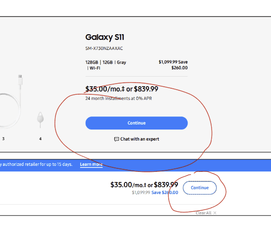
Scenario 01: The Checkout Confusion
Users successfully found products but hit a wall at checkout. The interface used vague labels like "Continue" instead of "Proceed to Checkout," and aggressive cross-sell pop-ups created cognitive overload.
Scenario 02: The Registration Wall
When attempting to book a TV repair, users encountered a "Product Registration" modal. They believed they could not proceed without registering a device, even if they were just seeking information.
The Fix: We recommended a "Guest Booking" flow that allows users to check service options without account creation.
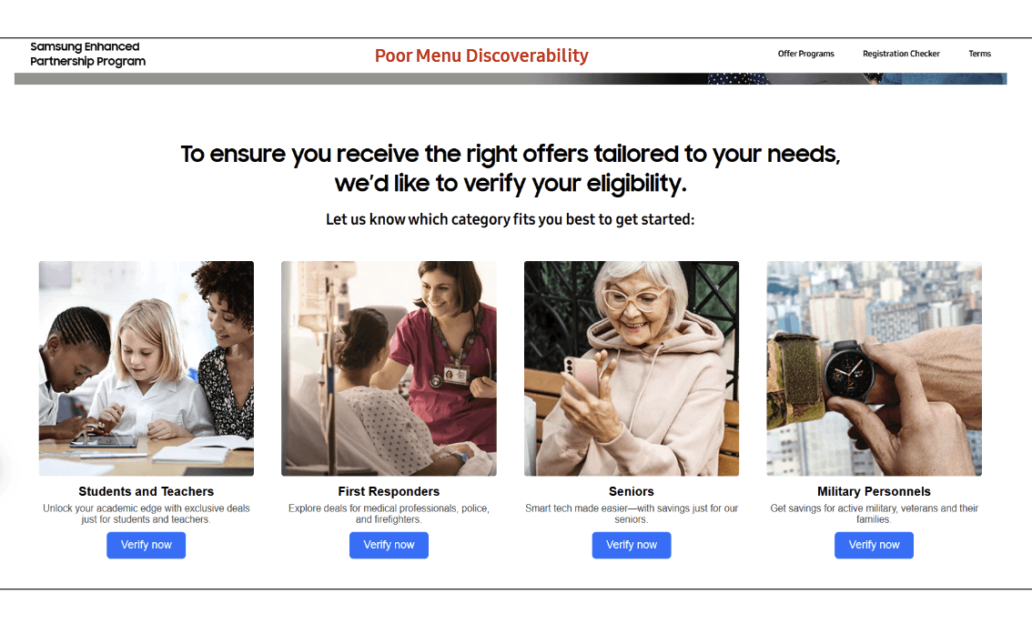
Scenario 03: Hidden Student Offers
Users could not find student discounts because they were labeled as "Partnership Programs." This internal corporate jargon did not match the user's vocabulary.
The Fix: Rename navigation items to "Student & Corporate Offers" to match user intent.
Conclusion & Recommendations
The Samsung Canada website is functional but feels "nebulous" to the average user. The information exists, but the navigation labels and page layouts often fail to match user expectations.
Our Top 3 Recommendations:
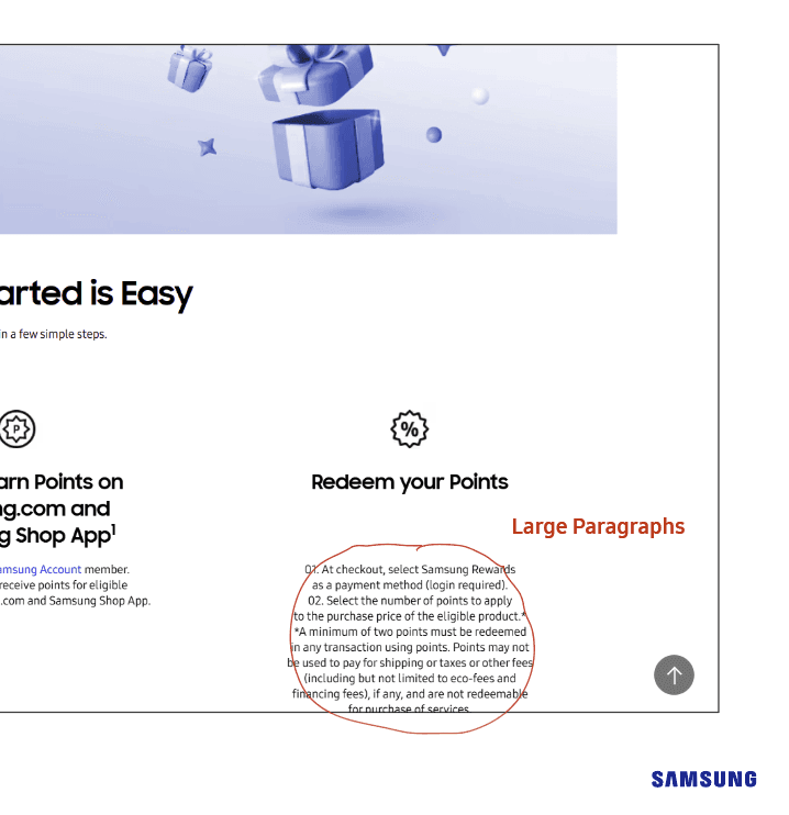
Ungate Information: Allow users to view Rewards Terms and Student Offers without requiring an immediate login.
Clarify Terminology: Change "Service Centre" to "Book a Repair" and "Partnership Program" to "Student Discounts" to align with user mental models.
Simplify Support: Implement a direct "Book Guest Repair" feature to prevent the "Registration Wall" from blocking support access.