Rebranding: Imam Development Program
A modern, dignified identity for a non-profit empowering leaders across Africa.
Imam Development Program (IDP)
Non-Profit / NGO
Brand Identity Designer
Brand Strategy, Visual Identity System, Guidelines, Social Assets
30+
The Challenge: Elevating a Mission
The Imam Development Program has a powerful mission: to "inspire and empower Imams to uplift their communities". However, their visual identity needed to evolve to reflect the professionalism, scale, and dignity of their work across Africa. The goal was to move away from a generic look to a brand that feels established, trustworthy, and modern without losing its cultural roots.
Core Objectives
Modernization: Create a clean, scalable identity suitable for 2025 and beyond.
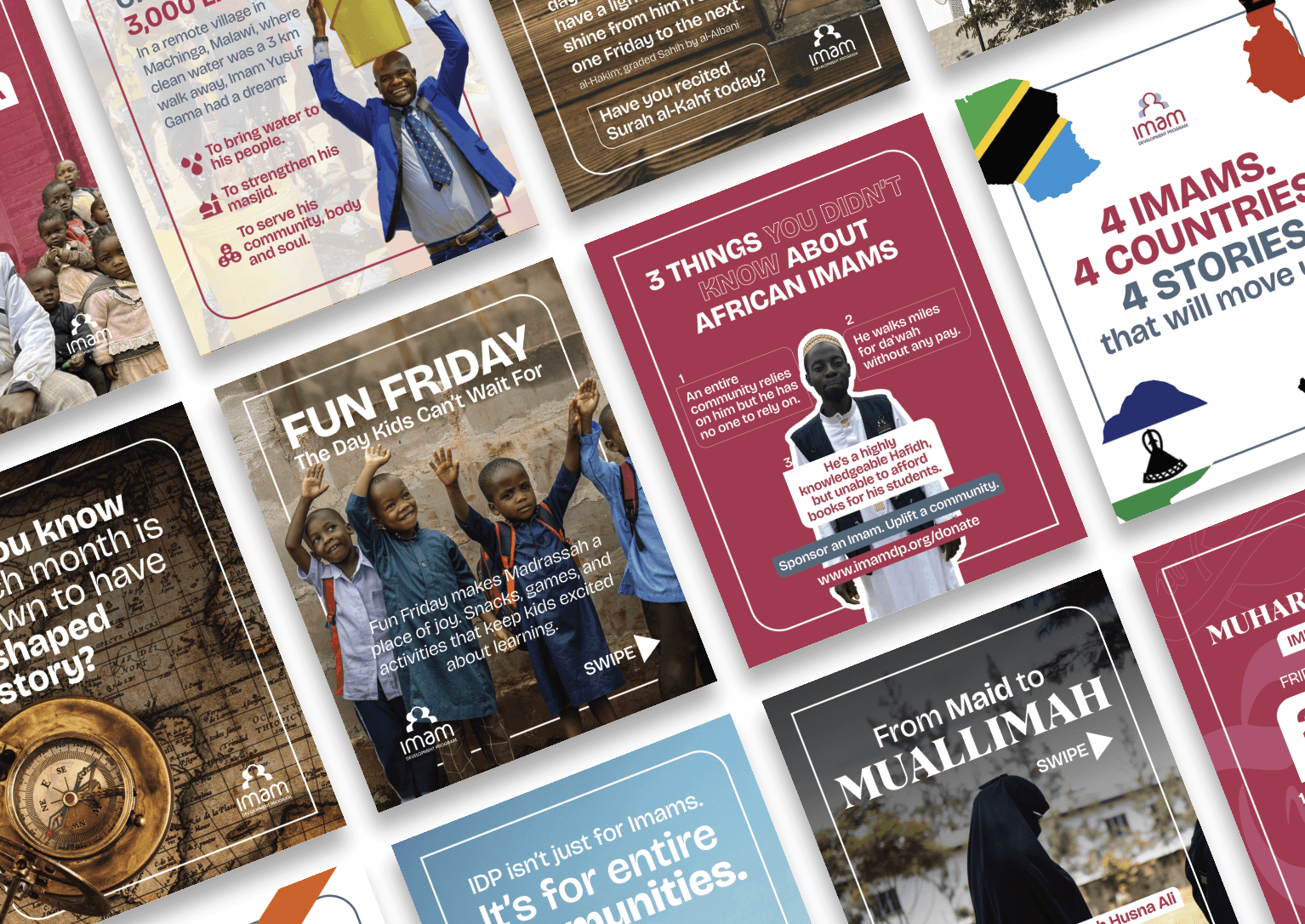
Consistency: Establish strict guidelines to ensure the brand looks professional across diverse mediums (from rural Malawi to digital Instagram campaigns).
Empowerment: The visual language needed to reflect the "Hero" status of the Imams they serve.
100%
Client Satisfaction
20+
Brand Assets and Templates Created
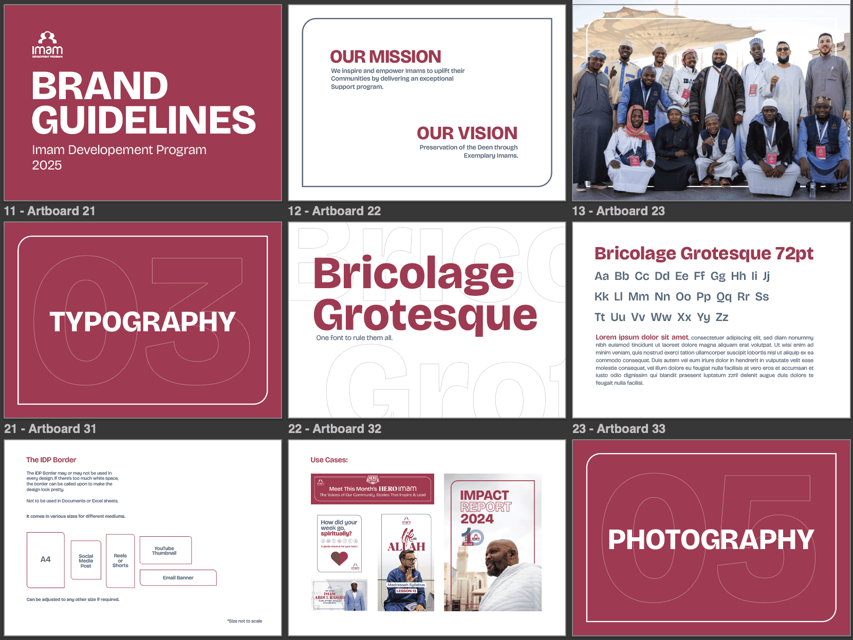
The Visual Identity System
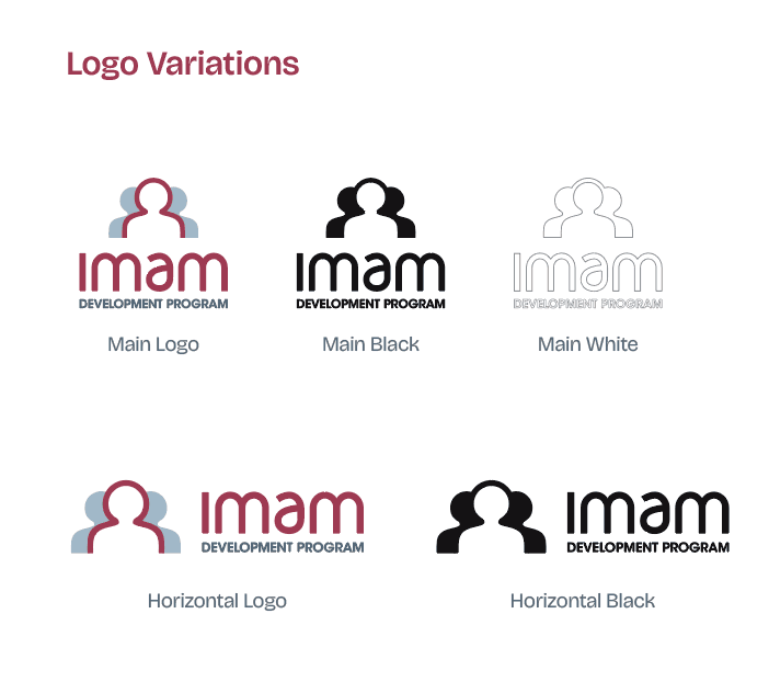
1. The Logo
We refined the logo to be versatile and legible. It features a stylized icon representing community and leadership, paired with a clean sans-serif wordmark.
Scalability: We created specific variations for different use cases, ensuring legibility from large banners down to a 25px digital icon.
Flexibility: The system includes a standard stacked version, a horizontal lockup for headers, and a simplified icon for social avatars.
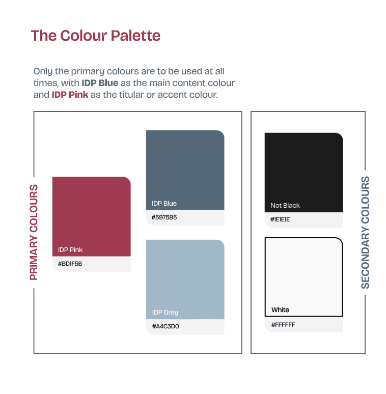
2. Color Palette: Dignity & Warmth
We moved away from standard corporate colors to a palette that balances professional trust with human warmth.
IDP Pink (#BD1F5B): Used as the "titular or accent colour" to grab attention and differentiate the brand from typical blue-heavy NGO branding.
IDP Blue (#597585) & Grey (#A4C3D0): These serve as the "main content colours," grounding the brand in stability and trust.
"Not Black" (#1E1E1E): We avoided pure black in favor of a softer charcoal to reduce visual harshness on screens.
3. Typography: "One Font to Rule Them All"
To simplify adoption for the internal team, we selected Bricolage Grotesque as the primary typeface.
Why Bricolage? It is a modern geometric sans-serif that is highly legible but has enough character ("grotesque" quirks) to feel human and approachable. It handles everything from ExtraBold H1 headlines to Regular body copy.
The "Pious" Accent: We introduced Albra as a secondary font strictly for "headers or quotes," adding a touch of elegance and tradition for spiritual content.
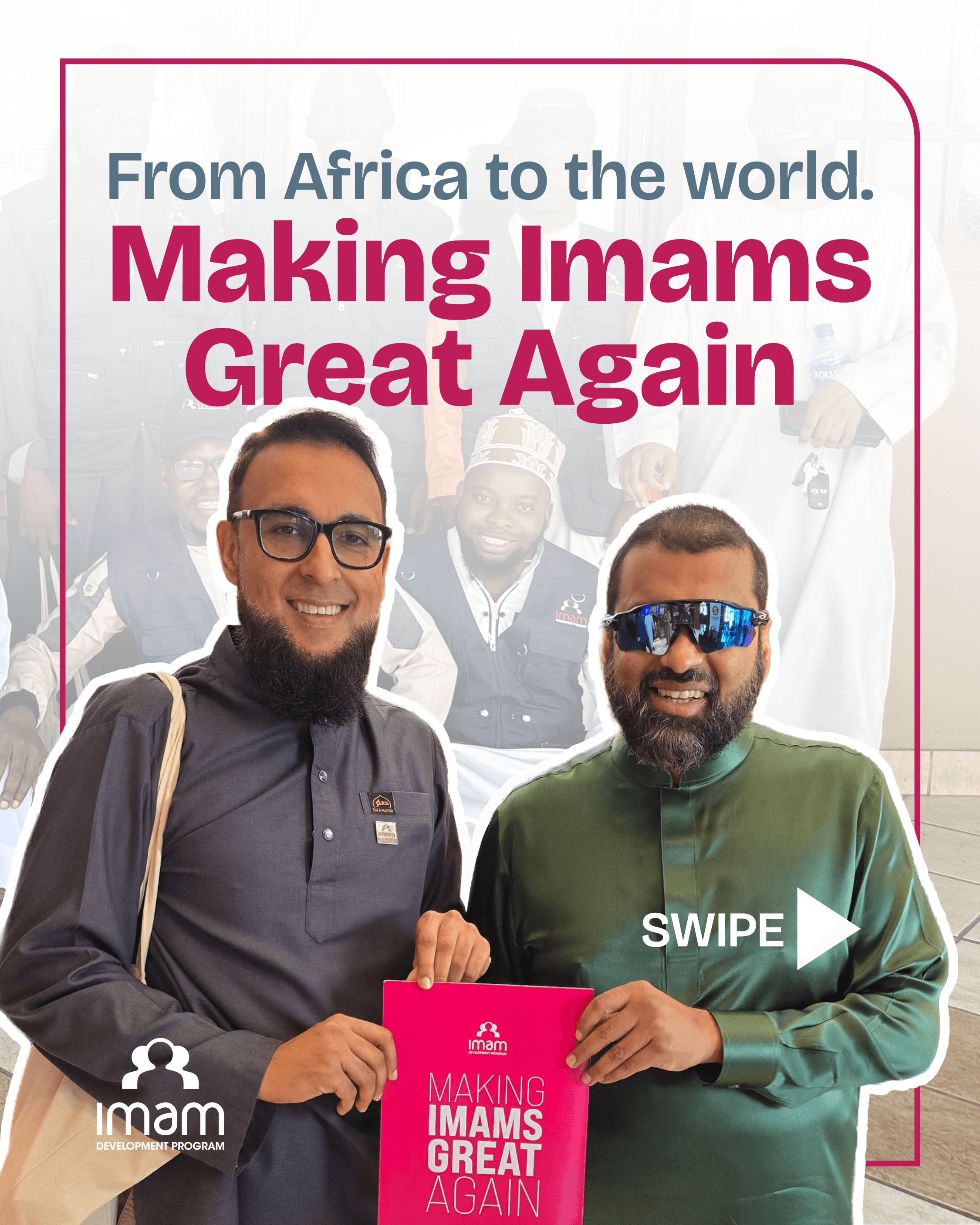
"Making Imams Great Again"
Conclusion
The new Imam Development Program brand is more than just a logo update; it is a tool for empowerment. By providing the organization with a robust set of guidelines—covering everything from "things to avoid" to specific color combinations—we have ensured that their visual presence is as strong and consistent as the leaders they support.