IA Redesign: Tesla Canada
Reimagining the information architecture of a minimalist giant to improve findability and conversion.
Tesla Canada
Information Architecture
UX Researcher & Designer
Revised Sitemap, Wireframes, Interactive Prototype
The Challenge: The Cost of Minimalism
Tesla’s website is famous for its extreme minimalism. However, our analysis revealed that this aesthetic choice was compromising user experience. The "overly simplistic" navigation structure caused significant friction in finding essential information.
Core Problems Identified:
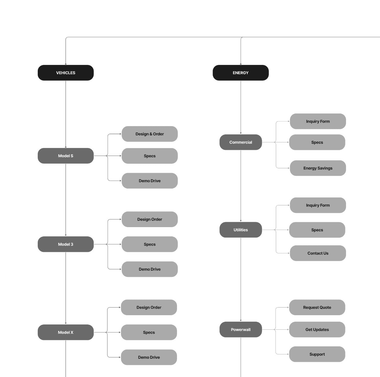
Decentralized Links: Essential utility links like "Support" were duplicated and scattered across unrelated categories (Energy, Charging), making them hard to track down.
Hidden Primary Actions: Critical conversion drivers, such as booking a "Demo Drive," were buried inside vehicle sub-menus rather than being visible upfront.
Low Findability: Users often had to "guess" icon meanings or click through multiple layers to find basic specs, increasing cognitive load.
The Solution: Structural Updates
We proposed a new Information Architecture (IA) that maintains the brand's sleek look while exposing critical paths.
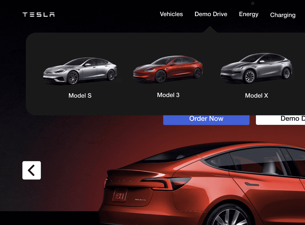
1. Elevating "Demo Drive"
The Change: We moved "Demo Drive" from a sub-menu to a top-level navigation item.
The Why: This is a critical conversion tool. By reducing the click depth, we made the path to purchase immediate and visible upon landing.
2. The "Support" Shift & Floating Chat
The Change: We introduced a persistent "Ask a Question" floating chat widget in the bottom right.
The Why: Users in our research struggled to find help. A persistent widget is a standard mental model for support, ensuring users can find help instantly without abandoning their browsing flow.
3. Streamlining the Footer
The Change: "Discovery" links (Careers, Customer Stories, News) were relocated from the main header to the footer.
The Why: This de-cluttered the top navigation, focusing the user's primary attention on products (Vehicles, Energy) and purchasing tasks.
35%
Improved onboarding process
25%
Increase in user retention
84%
Increase in time spent on website
Validation & Testing
We didn't just redesign it; we tested the new structure with users to validate the IA changes.
First-Click Testing: Finding Support
We presented users with a scenario: "You are having an issue with your vehicle's mobile app. Where would you click first?"
Result: 5 out of 5 users successfully selected the new "Support" link immediately.
Outcome: Validated the decision to add "Support" as a clear header option rather than burying it in utility menus.
Five-Second Test: Discoverability
We flashed the new homepage for 5 seconds and asked: "Did you notice any way to get immediate help?"
Result: 100% of participants noticed and recalled the "Ask a Question" chat feature.
Conclusion
Minimalism should not come at the expense of functionality. Our re-evaluation showed that while whitespace focuses attention, excessive separation breaks the scanning flow and lowers trust. By restructuring the IA to prioritize "Demo Drives" and "Support," we created a navigation system that is as functional as it is beautiful.